Posted on:
16th May 2017 in Categories Ilustration 1
I decided to visit Storiel in Bangor to collect reference for this exercise. It has recently moved to a new building, which turned out to be very spacious and the exhibitions are beautifully displayed. It also has an art gallery which, at the time of visiting, was hosting the North Wales Open exhibition. The staff were very welcoming and helpful.
I took photos of the exhibits and have catalogued them below.
5 – 9 years
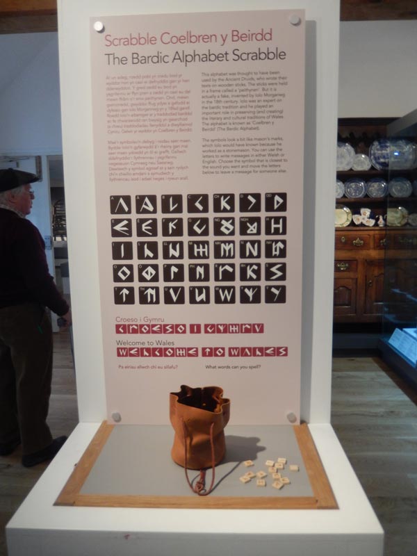
Interactive old celtic alphabet display
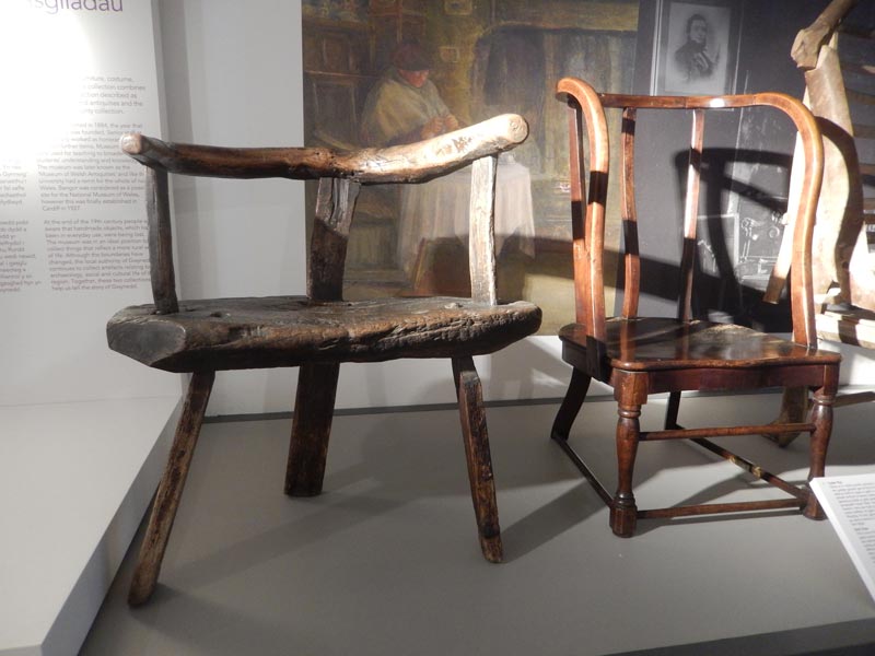
Chairs made with pieces of wood or branches
Crown of a Welsh prince
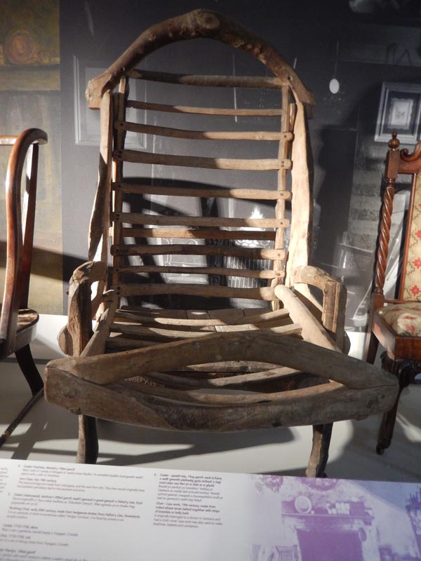
Early design for a reclining chair
Collection of weaponry
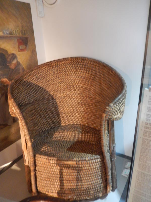
Comfortable looking wicker chair
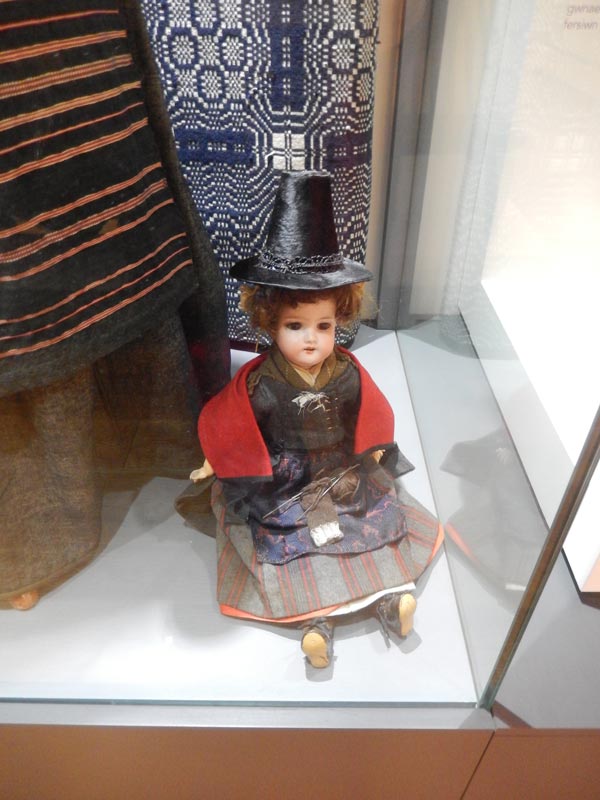
Doll in Welsh costume
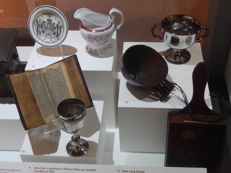
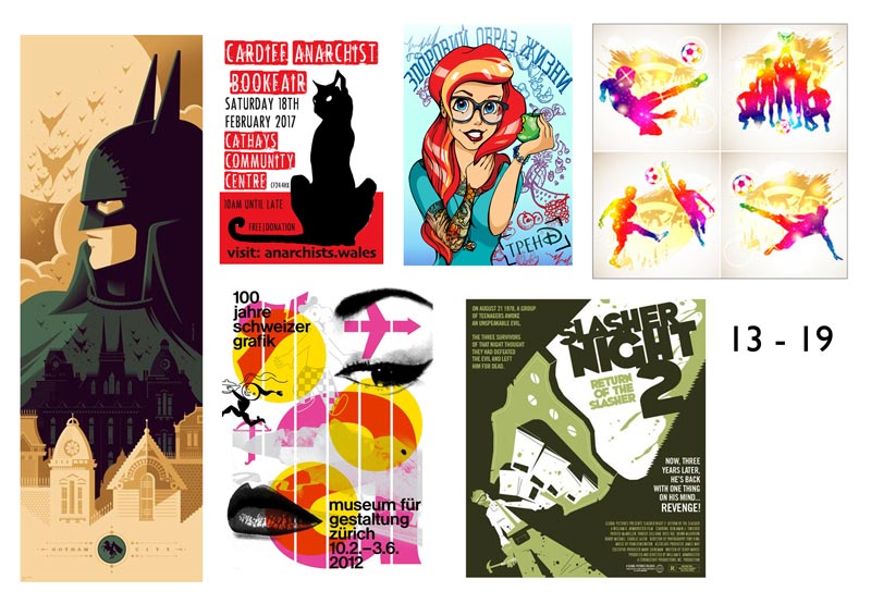
13 – 19 years
Selection of craft items
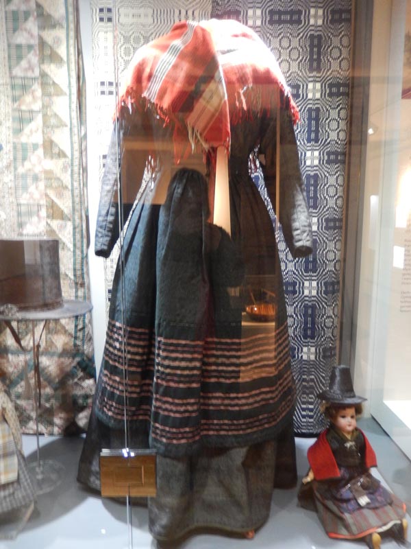
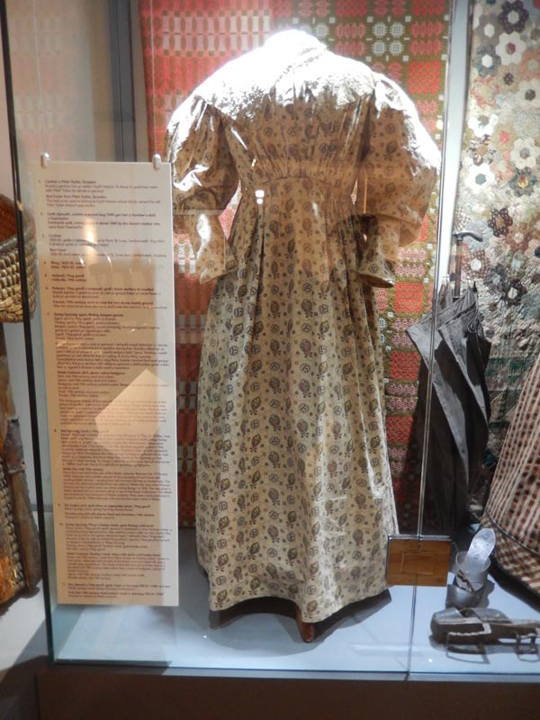
Clothes that Welsh women typically wore
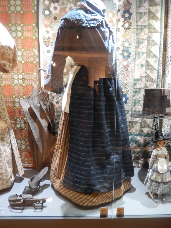
Clothes that Welsh women typically wore
Clothes that Welsh women typically wore
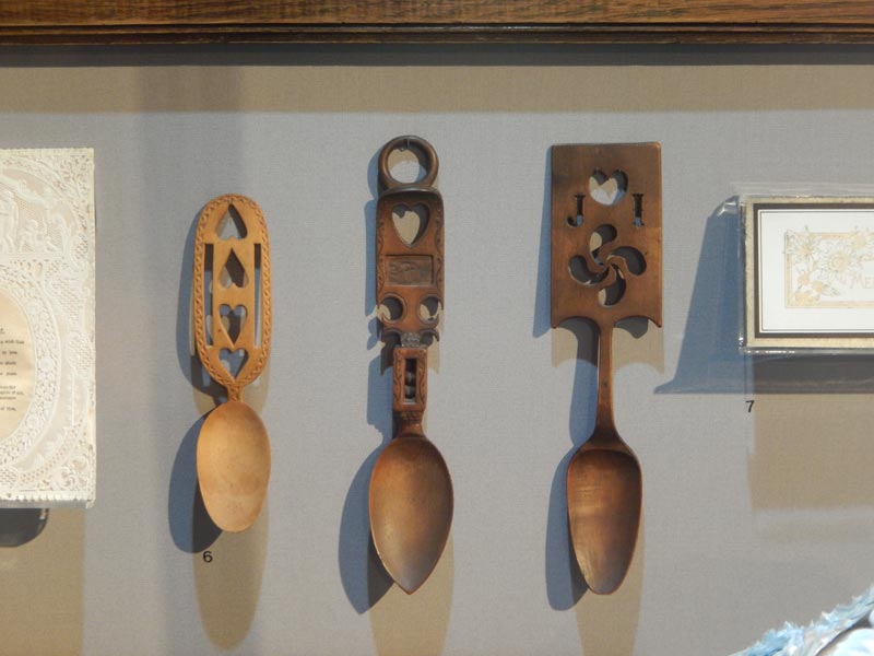
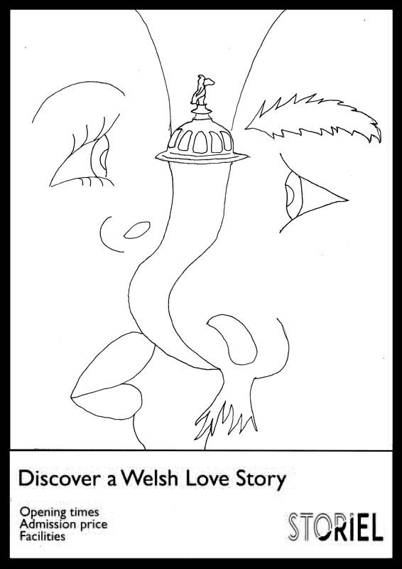
Three lovespoons
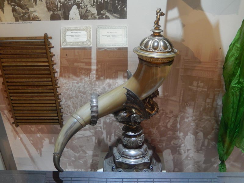
A horn vessel given as a wedding gift to a notable person
Collection of weaponry
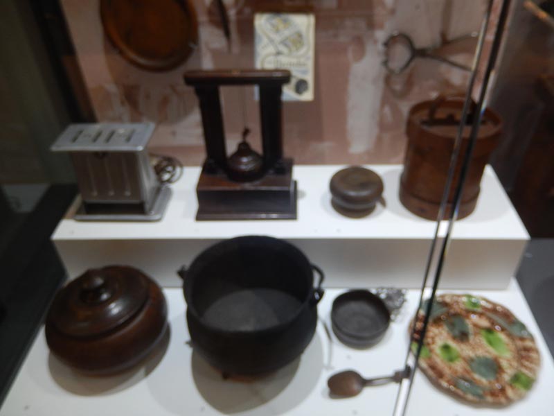
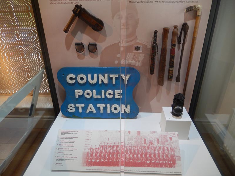
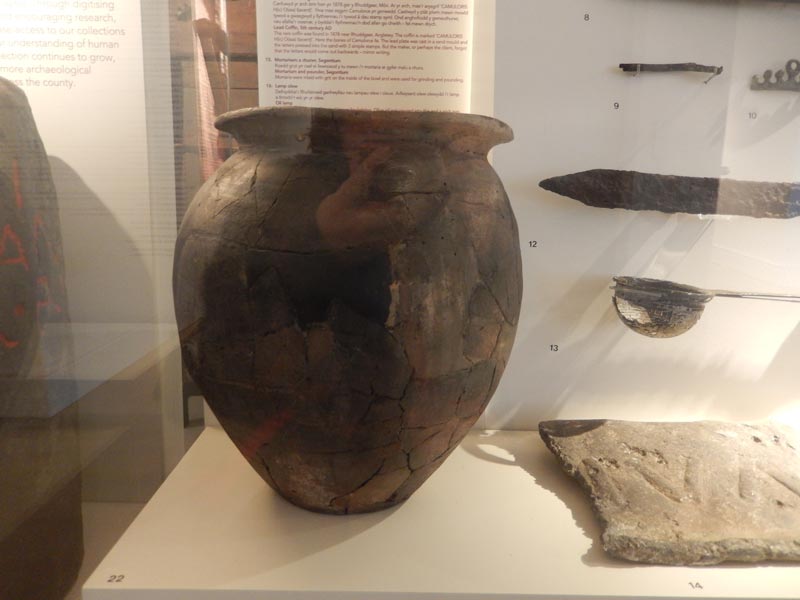
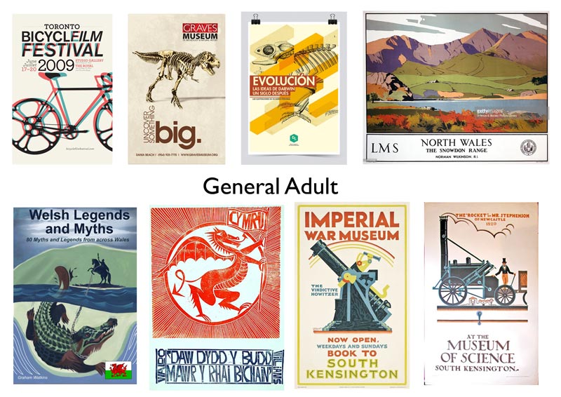
General adult
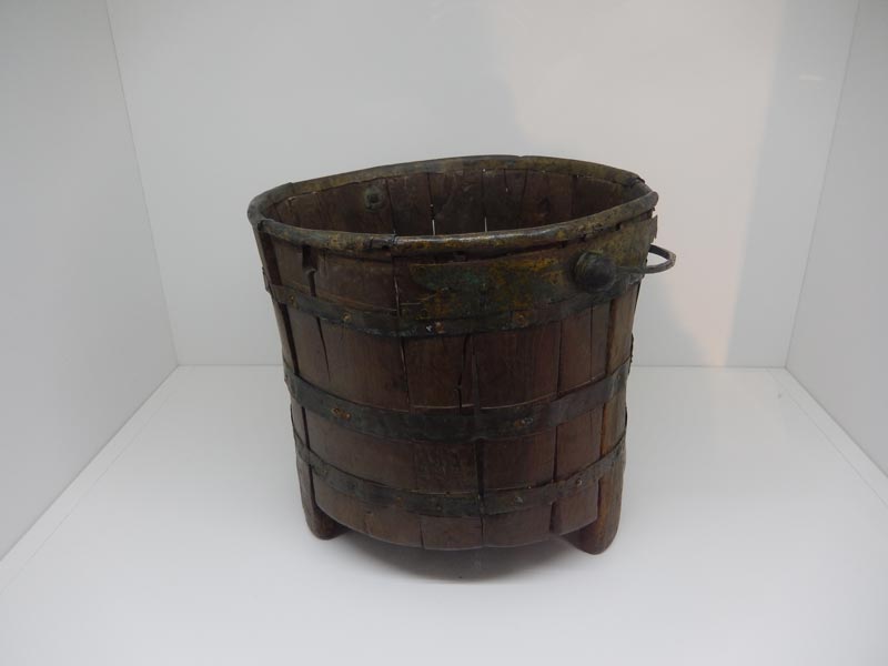
An old wooden bucket
A selection of domestic utensils
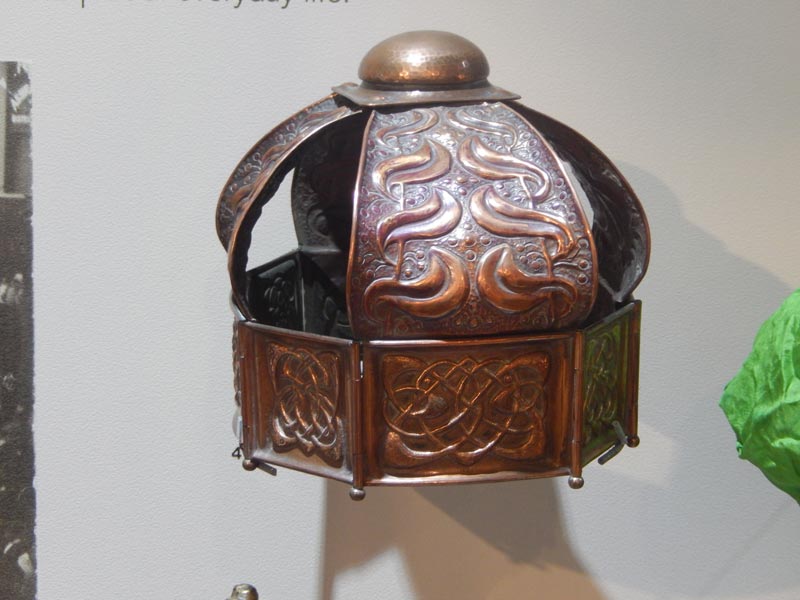
A selection of decorative utensils
Police tools
Large earthenwear pot
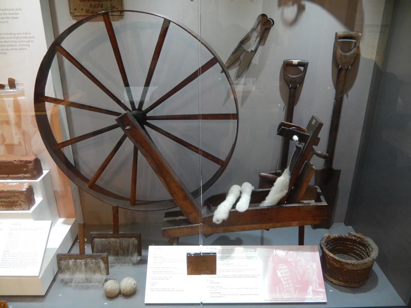
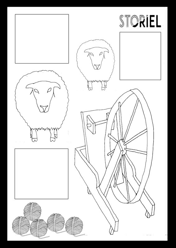
A number of indoor and outdoor tools for cottage industry tasks
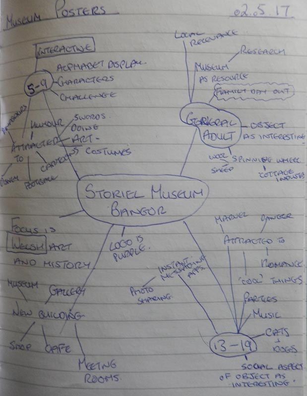
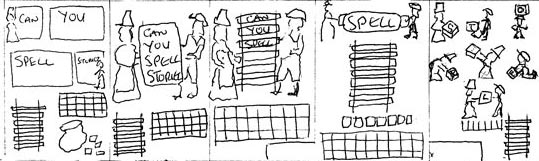
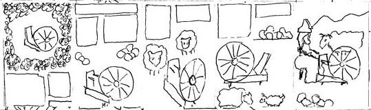
I mind mapped out some ideas for the 3 age groups and penciled up some thumbnails. Based on those ideas I selected the alphabet display for the youngest group, the wedding gift for the teens and the wool spinner wheel for an adult audience.
mindmap for poster ideas
Thumbnails for 5 – 9 year olds
Thumbnails for 13-19 year olds
Thumbnails for a general adult audience
I went ahead and did some research and created moodboards for the 3 groups.
Moodboard for poster for 5-9 year old audience
Moodboard for poster for 13-19 year old audience
Moodboard for poster for general adult audience
I think young children would be most interested by a cartoony style poster, while teenagers are more attracted to bright/fluorescent colours. I felt that, for a general adult audience, the poster should be more ‘arty’ but,having worked out my design idea with watercolours and charcoal I decided that it didn’t work. There wasn’t enough contrast between the watercolour and the charcoal/chalk to be eye catching from afar and I feel the composition is boring. This was a result of losing time over Easter and then rushing the posters to try and catch up. I then went with a more decorative approach keeping the object itself as the main point of interest and am happy with the look.
Linework
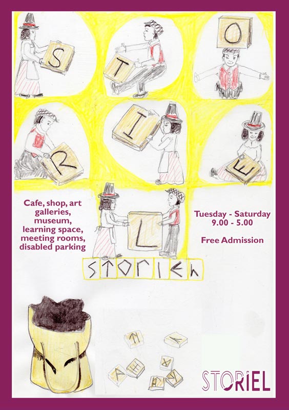
Linework for 5-9 year old poster
Linework for teen poster
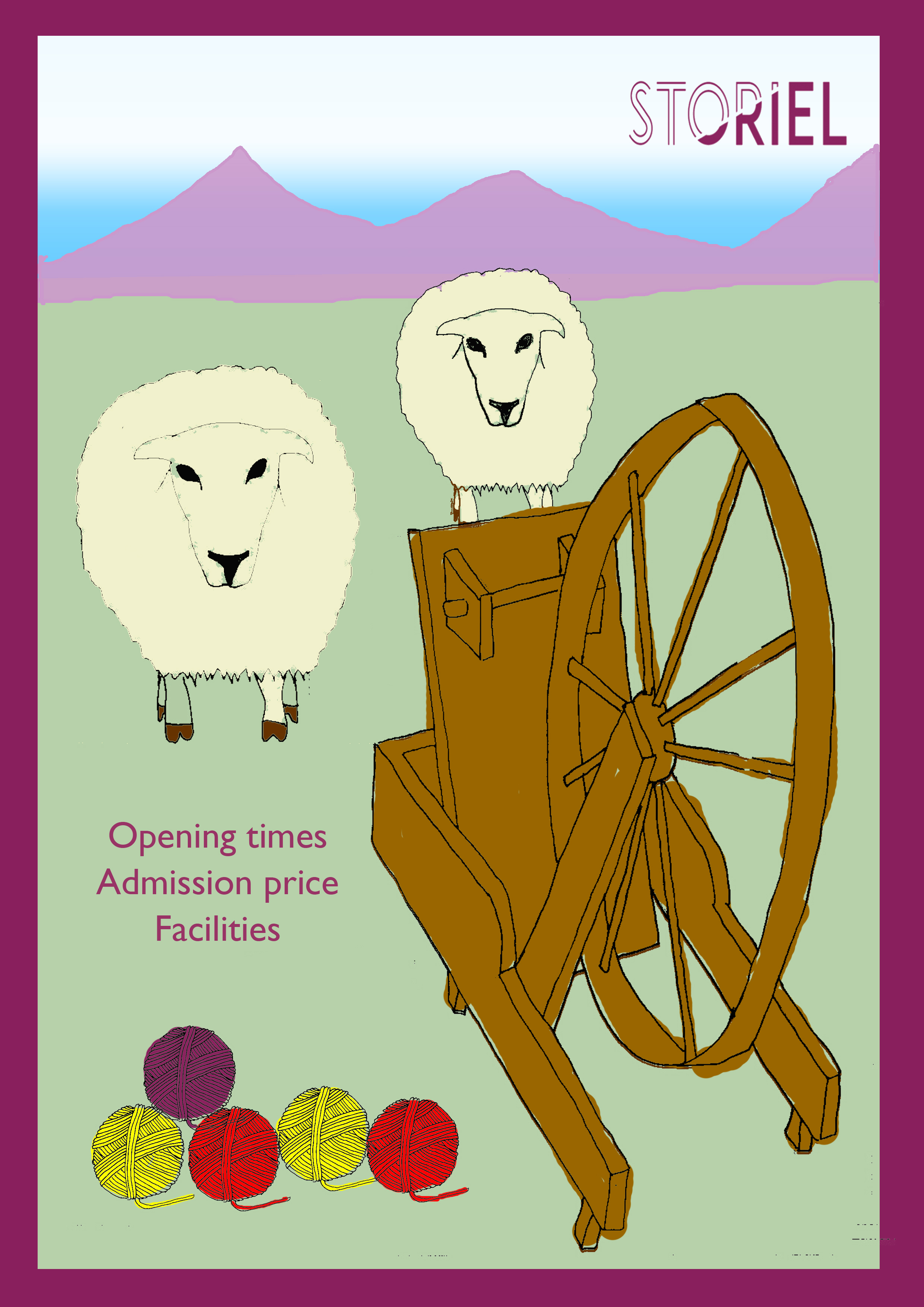
Initial adult poster linework
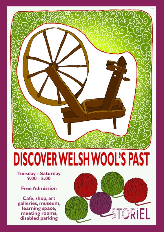
Final adult poster linework
Colour Visuals
I am still working out how to incorporate colour visuals into my process so some of these are done in Photoshop and some of them are done with Inktense.
Colour visual for 5-9 year old poster
Colour visual for teen poster
Colour visual for intial adult poster idea
Colour visual for final adult poster idea
Final Artwork
Final art for teen poster
Final general adult poster
Some problems I ran into included my scanner not picking up the neon colours I had used for the teen poster. It turns out that the type of lamp my scanner has wont pick up this range. I corrected somewhat in Photoshop but the result is still not as bright.
I think the composition of the teen poster works as it focusses on the relationship represented by the object and should be of some interest to this age range. I think, though, that devloping an interactive mobile app that allowed teenagers to snap themselves in historical scenarios and share with friends would be more likely to encourage them. I am reasonably pleased with the final adult poster although I lost the more natural gradiant effect I had achieved with Inkense in the colour visual by colouring in Photoshop. I feel that the purple border (same colour as logo) and logo tie the posters together sufficently to make it clear they are for the same place.
Update Following Feedback
In this update I have tried to make the woman’s nose somewhat more flattering. I have also removed some highlights that weren’t improving the image.
Related Posts:
3 Things You Should Know About the North Wales Open 26th June 2017 I am super pleased to have had my 'Egret Ready to Strike' piece accepted into the North Wales Open art exhibition 2017. Places The exhibition…
Qube Open Exhibition 13th August 2017 Am very pleased to have been shortlisted as one of 58 from 110 entries for the Qube Open Art Exhibition. It is being held in…
Drawing from Reference 15th January 2017 For this exercise we had to collect reference material from different sources and catalogue the images under given categories. I combined some Google searching with…
Wonderful Wildflowers - Solo Exhibition in Oswestry 8th February 2018 I spent the six months since the Qube Open preparing for this solo exhibition in Oswestry at the Qube gallery. The gallery is a lovely…
Venue for First Solo Exhibition 17th October 2016 Well ...., my first solo exhibition had no significant hitches! Phew! Actually it was a very nice day, chatting about the art with some lovely…
Illustration1 Exercise List 11th December 2017 There follows a list of links to all the exercises in the course. I have set each link to open in a new tab so…
Currently only dispatching to U.K. addresses. Sorry for the inconvenience. Ceri xx
Manage Cookie Consent
I use cookies on this site to find out basic things about visitor traffic, nothing personal. Some features of the site depend on cookies to work properly. In the future you May see adverts for this site on Google or Facebook.
Functional
Always active
The technical storage or access is strictly necessary for the legitimate purpose of enabling the use of a specific service explicitly requested by the subscriber or user, or for the sole purpose of carrying out the transmission of a communication over an electronic communications network.
Preferences
The technical storage or access is necessary for the legitimate purpose of storing preferences that are not requested by the subscriber or user.
Statistics
The technical storage or access that is used exclusively for statistical purposes.The technical storage or access that is used exclusively for anonymous statistical purposes. Without a subpoena, voluntary compliance on the part of your Internet Service Provider, or additional records from a third party, information stored or retrieved for this purpose alone cannot usually be used to identify you.
Marketing
The technical storage or access is required to create user profiles to send advertising, or to track the user on a website or across several websites for similar marketing purposes.


There are no comments yet ... go on, be the first!