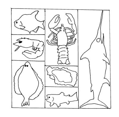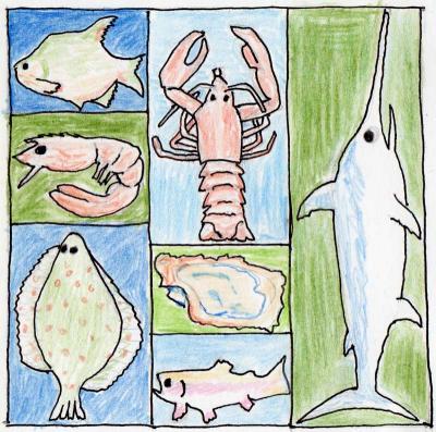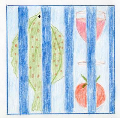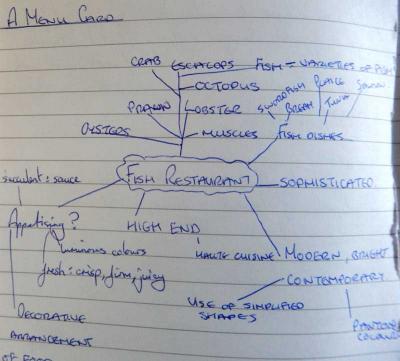
It can be seen that ‘fish’ and ‘seafood’ are fairly interchangeable which means that the graphic could refer to other seafood.
Trying to define the style of the graphic I did some research in to ‘modern’ and ‘contemporary’. According to this article, with regard to interior design, the terms are often used interchangeably but actually refer to the styles of two different time periods. The similarities, however, include
simple, uncluttered spaces with smooth, clean lines and artistic flair.
Contemporary is usually used to mean, of the now or current style so the description in the brief is somewhat ambiguous and I would want to clarify this with the client.
So I collected some images that I felt fitted the description on this Pinterest board as a moodboard. To determine colours to use I visited Pantone’s season range, however, I would use the colours of the restaurant decor in a real world situation.
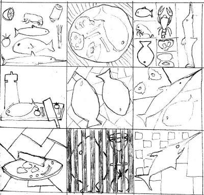
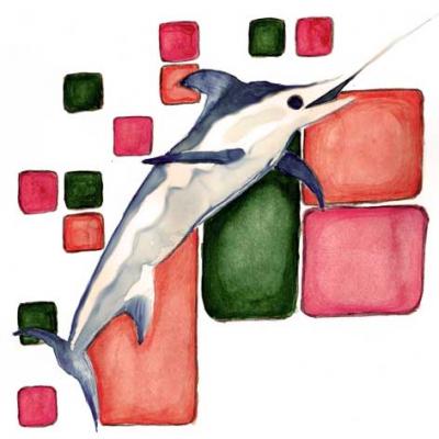
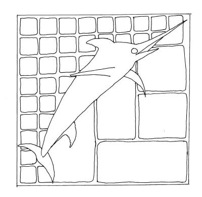
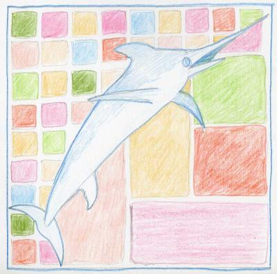
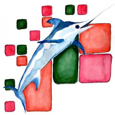
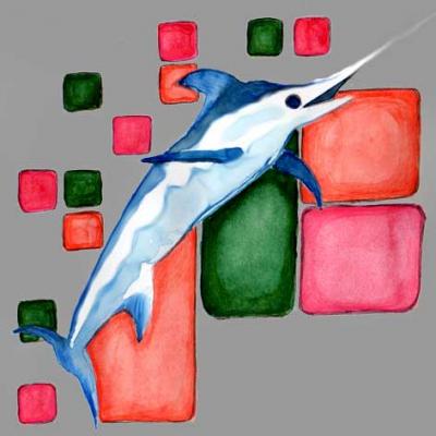
I think the swordfish hints at the speciality nature of the menu with th ediagonal placement giving dynamism, while the coloured tiles around it give a contemporary feel. I developed the idea by leaving out some of the tiles to give a less boxed in look. I also left out some of the colours to give a less confusing image which is not so closely tied to Spring. I rendered them in watercolour and coloured pencil and some of the tiles have a less than geometric finish. I played with the colours of the final in Photoshop:
