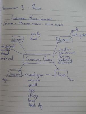
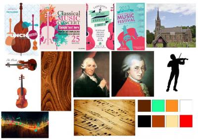
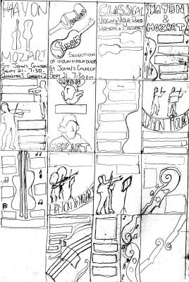
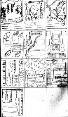
Well this one was fun! Serendipitously, my son is planning a classical music concert with some friends for September. Less fortunately the requirements for the poster changed, midway through my ‘process’… Initially I understood that it would be 2 friends playing a selection of Mozart and Haydn violin and viola duets at achurch in Penymynydd. I started my making a mindmap around this information and then created a moodboard and a run of thumbnails.
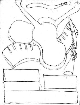
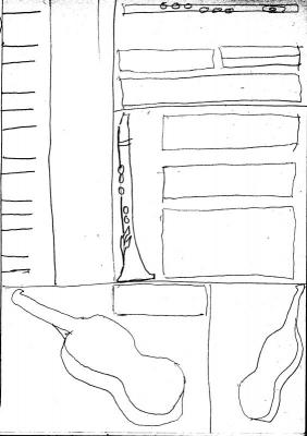
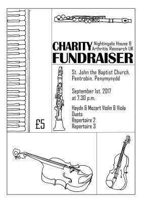
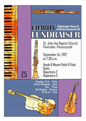
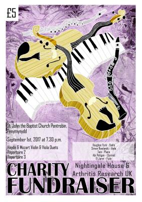
At this point further information ‘came to light’ that there would be 5 players in the concert, each with their own instrument and a more diverse repertoire. Some of my initial ideas remained useful, however the thumbnails were of no use. So I drew up another set of thumbnails which developed the idea of focussing more on the different instruments to give the idea of 5 friends. At this point I must say my son suggested the idea of a ‘wavy’ piano which, I think, turned out to be the best final piece. I chose 2 thumbnails and roughed these up before creating the linework to show ‘the client’ – aka my son! Although he is quite discerning about the ‘look’ of things, he can’t always visualise a finished piece so I decided to render both pieces.
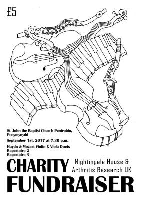
Of course there is still some information missing from the poster relating to the repertoire but names of players were added following feedback from client. As such the rest of the repertoire can be added nearer to the time to start promoting the concert.
On reflection, it was a good lesson in getting requirements before beginning work but also that the process of developing ideas is a good way to iron out misconceptions, errors and stylistic ideas. The concert group have chosen the wavy design, which I also preferred, so there has been a good outcome from this assignment.
My process of creating the art included creating the background textures with ink and clingfilm and then working with these in photoshop. I had intended to develop the colour blocks using stencils and paint and a more hand-drawn look for the instrument details. However, my son was already favouring the wavy design so I felt this would not be a good use of time. In the selected, final piece, the purple background does not come forward too much because purple is a cool colour. The texture on the instruments helps to bring them to attention and I have provided contrasting black and white effects for the text blocks to make them stand out. Overall it should catch the eye from a distance. With the other design I used the bright orange inky background as fills for the instruments to give them contrast against their complimentary blue and purple colour blocks, in a double complimentary colour scheme.
