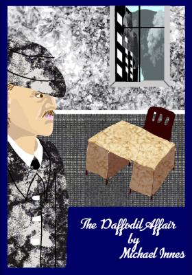
This exercise was based around an excerpt from ‘The Daffodil Affair’ by Michael Innes. The excerpt describes a rather bleak room which I interpretted to mirror the personality of Inspector Appleby. From the excerpt I felt he would be quite stern and introspective. He seems troubled by the responsibility of the abduction files but appears to assume the worst of the victims themselves. So his face contracts in a frown as he tries to work out the puzzle. I think he would wear plain grey clothes, hat and long jacket.
The only furniture in the room that is described in the excerpt is a large desk. I also assume there is a chair as the passage says “he rose…”. The story is set in ‘wartime London’ and his office is high up in New Scotland Yard.
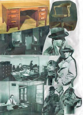
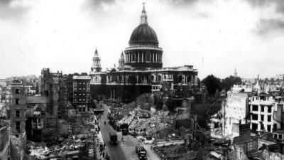
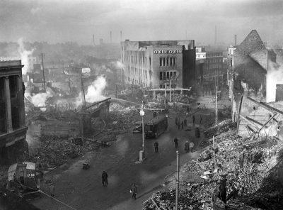
Our first task was to find reference material for the period which led me to wonder which war the book refferred to. A quick search on Goodreads and Wikipedia helped me identify the war as WW2 as The Daffodil Affair is set in 1942. I collected reference on men’s clothing and office furniture as well as some war time pictures of the streets of London, included below.
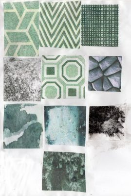
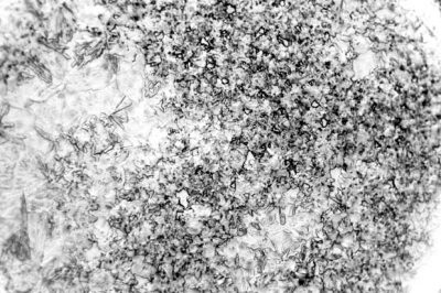
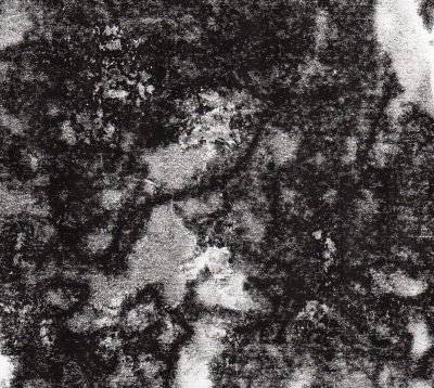
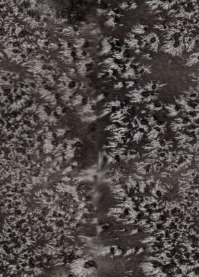
The next step of the exercise was to choose patterns and textures associated with a word we would use to describe the scene in Appleby’s office. I chose the word stark and looked for images with few, highly contrasting tones. The colours were mainly grey, brown or a dull green. I also made some textures with black ink, watercolour and salt.
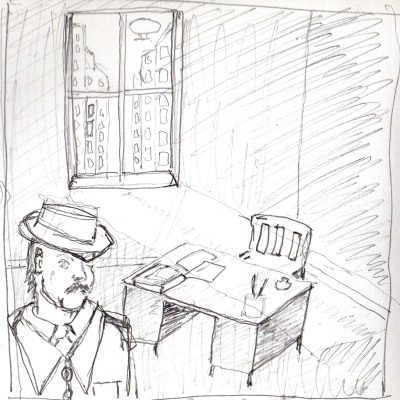
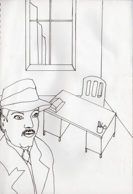
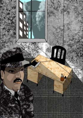
Next, I sketched up some ideas for the book cover. Having read some of the thorough reviews on Goodreads I had a further understanding that the novel itself is somewhat hillarious and chaotic in nature. I was torn between depicting chaotic scenes outside the window or the bleak office interior. I felt it was important to show the desk in the light of the window so I decided to work the image out in a cartoony way to agree with the silliness of the novel.
On reflection Appleby’s expression could be more ‘frowny’ and grim. I think the pattern on his clothes works with the chaotic nature of the novel but doesn’t really add to the characterisation of Appleby. I considered the shadow that crossed the window’s “parallelogram of light” 12 times as I wondered whether to include this in the illustration. It does seem ominous but I couldn’t think of where I could find out more about this. Probably if it were an actual brief, this is something I would ask an art director. I thought it possible that it could be from war planes or bomb clouds.
Update Following Feedback
