Style is a much discussed topic among ilustrators. Some advocate having one style and sticking to it which clearly means finding a style to begin with. Others seem to have success by distinguishing between the different styles they can work in.
For this exercise I selected gouache as a medium to research as I have started illustrating my book with it and wanted to explore how other illustrators work. Initially I searched in Fifty Years of Illustration and found about 6 illustrators working in gouache. This didn’t seem like many as I had previously read that gouache is a very popular medium for illustrators, although possibly some of the illustrations labelled as ‘book or album covers’ may have also been gouache. I also searched on AOI and theispot but neither indicated clearly whether the illustration was rendered with gouache. I searched on ChildrensIllustrators because it was clearer about medium. I found a number of illustrators using gouache in ‘100 Illustrators’ but the majority of the work in these books seems to be digital.
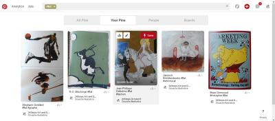
- they used metaphore
- worked in a whimsical style
- worked in a flat style
- worked in a 3d style
- used distortion/exageration
- worked in a cartoon style
- worked in a fantasy style
- worked in a caricature style
- worked in a surreal style
by tagging them within this ‘Gouache Illustrators’ Pinterest board. Some of the illustrators fell into 2 or more categories.
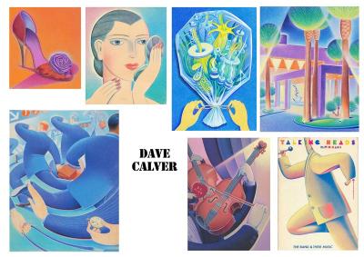
Dave Carver
From the initial artwork of this artist I viewed I described him as working mainly with distortion. However, having looked at his other works on his website he also employs metaphor and a cartoon style in some images. I really liked the curvy lines he used in the original image and the sense of movement in the piece, which was why I chose this artist.
Zohar Lazar
Zohar’s illustrations tend to be moody and he has a focus on the surreal. His characters in particular have a surreal zombie-like appearance. His style is very different to mine although I enjoy the atmosphere he creates which is neither overly gory nor boring. In the original image I selected he uses a smudgy background and lots of gooey drips.
My Adaptations
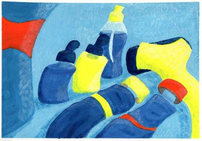
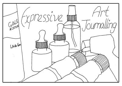
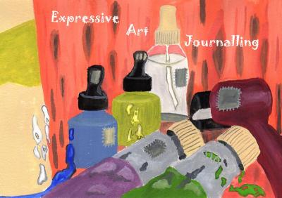
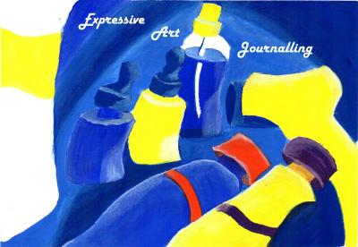
I chose the linework for the ‘view point’ exercise to rework in the styles of these two different artists.
Update Following Feedback
