The way elements are placed within a frame has an effect on how the viewer understands the image. In particular placement can effect depth of the image, narrative, a sense of movement and scale. In this exercise we experimented with 3 subjects:
- a child running
- a tree
- a building
I chose to work in Photoshop simply for efficiency and to save paper and ink. Also it gave me a more fluid range of scales to work with.
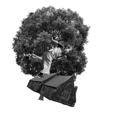
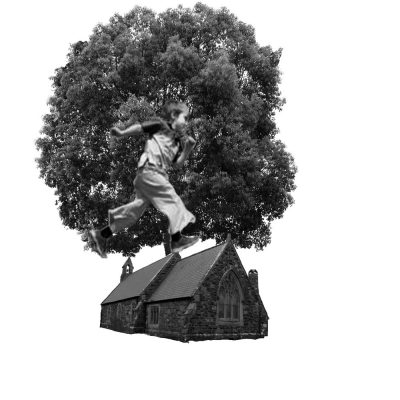
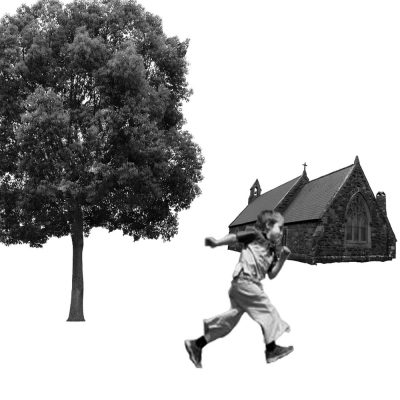
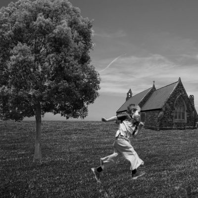
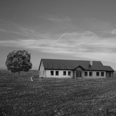
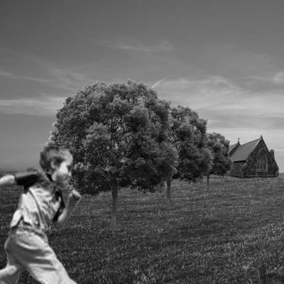
In the first image below, the elements are all at odd angles and it is clearly not realistic. However, the angles do add to a sense of rotation and falling, which could be a useful device in a more realistic scene. In the second image the elements are ‘lined up’ but being out of proportion in relation to their arrangement, little sense can be made from this image. In the third image the child is over the top of the church, suggesting the church is further away, however, as a whole the elements ‘float’ in the space of the frame. A horizon line is provided in the fourth image which grounds the elements and immediately creates a sense of depth. The elements rest on the ‘ground’ in relation to the furthest ground visible in the frame.
The fifth image shows the elements parallel to the sides of the frame, creating a sense of grounding. The image seems flat and there is no sense of movement. Here, also, the figure is much smaller than the other elements which signals some correctness regarding the proportions of the elements. The size of the figure here creates a feeling of distance from him and allows more emphasis to fall on the environment. I get the sense that the figure is alone and within the context of a narrative, something may be about to happen or the focus is on where the character is within their world.
The sixth image is my personal favourite as it has a strong direction of travel through the image and the diagonal placement implies a dramatic narrative. The repetition of the trees guides the eye towards the church and the larger figure in the foreground seems to be running in that direction – perhaps for sanctuary from a hoard of zombies!
Update Following Feedback
My tutor commented that the images produced were reminiscent of ‘Christina’s World’. Having looked this up I found it is a painting by Andrew Wyeth done in a magical realism style. Photographic realism combines with an element of the mysterious to create this style as I understand it.
