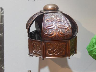
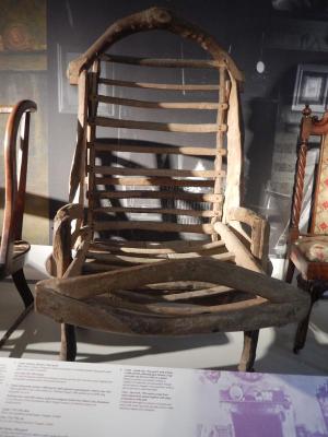
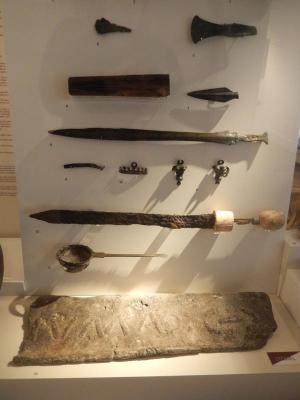
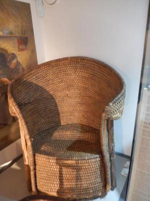
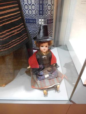
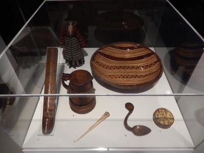
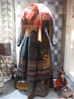
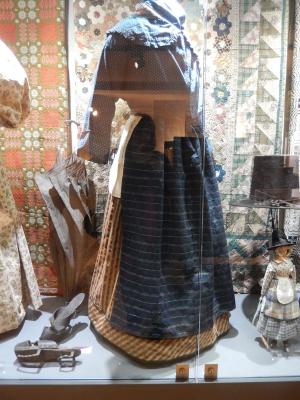
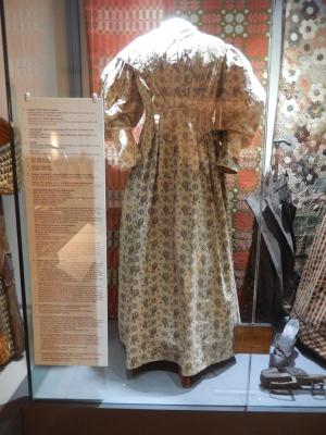
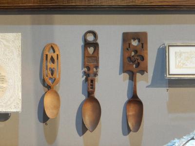
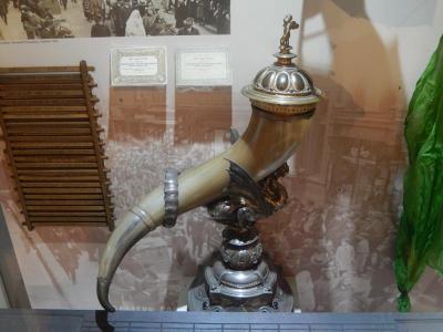
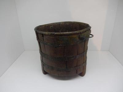
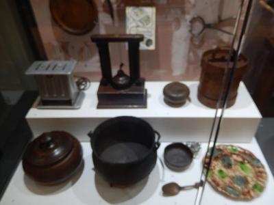
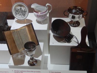
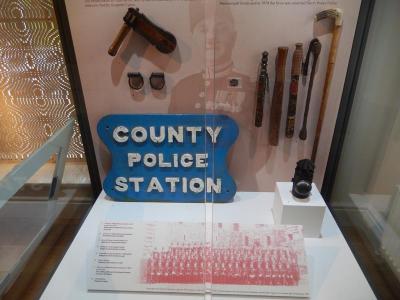
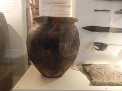
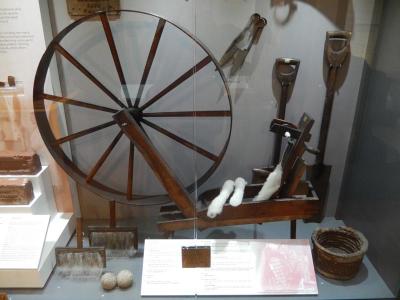
I decided to visit Storiel in Bangor to collect reference for this exercise. It has recently moved to a new building, which turned out to be very spacious and the exhibitions are beautifully displayed. It also has an art gallery which, at the time of visiting, was hosting the North Wales Open exhibition. The staff were very welcoming and helpful.
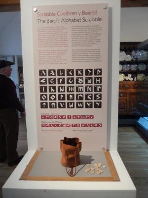
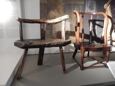
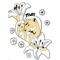
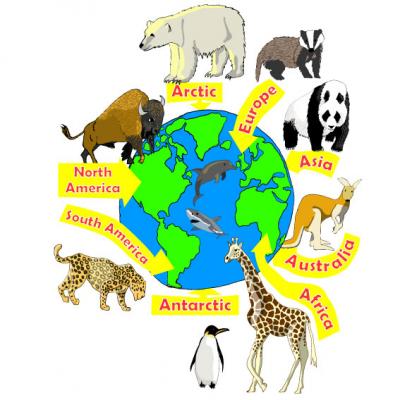
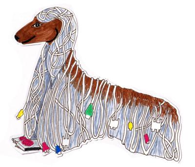
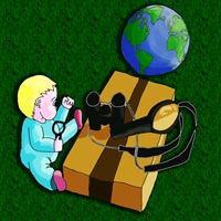
I took photos of the exhibits and have catalogued them below.
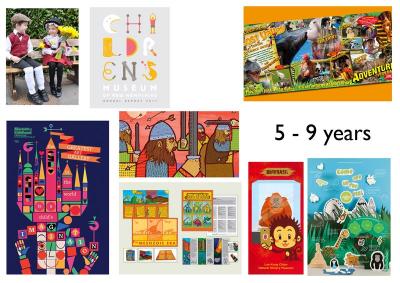
5 – 9 years
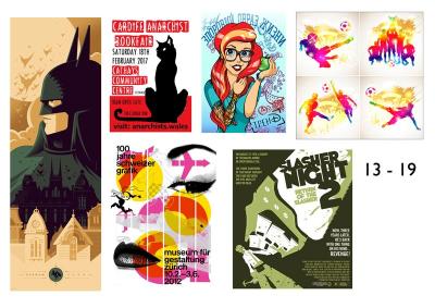
13 – 19 years
General adult
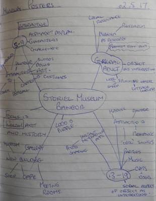
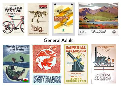
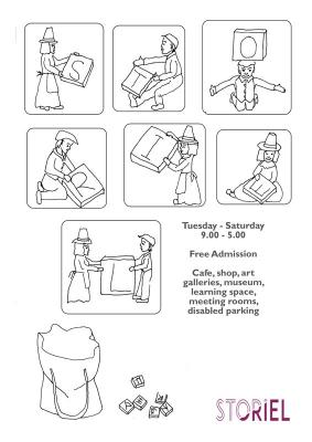
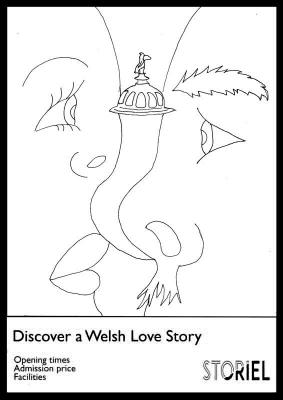
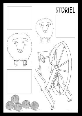
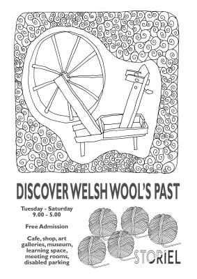
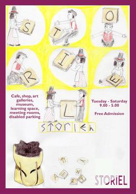
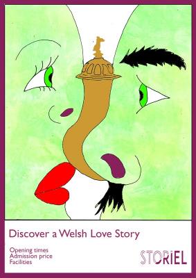
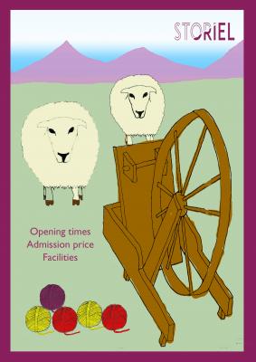
I mind mapped out some ideas for the 3 age groups and penciled up some thumbnails. Based on those ideas I selected the alphabet display for the youngest group, the wedding gift for the teens and the wool spinner wheel for an adult audience.
I went ahead and did some research and created moodboards for the 3 groups.
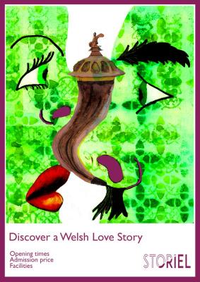
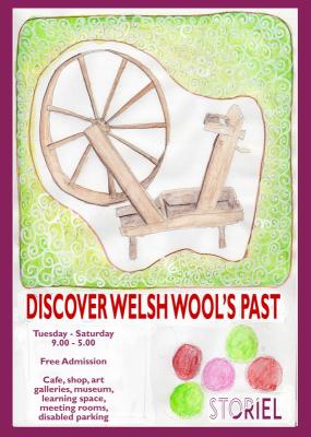
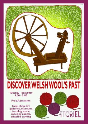
I think young children would be most interested by a cartoony style poster, while teenagers are more attracted to bright/fluorescent colours. I felt that, for a general adult audience, the poster should be more ‘arty’ but,having worked out my design idea with watercolours and charcoal I decided that it didn’t work. There wasn’t enough contrast between the watercolour and the charcoal/chalk to be eye catching from afar and I feel the composition is boring. This was a result of losing time over Easter and then rushing the posters to try and catch up. I then went with a more decorative approach keeping the object itself as the main point of interest and am happy with the look.
Linework
Colour Visuals
I am still working out how to incorporate colour visuals into my process so some of these are done in Photoshop and some of them are done with Inktense.
Final Artwork
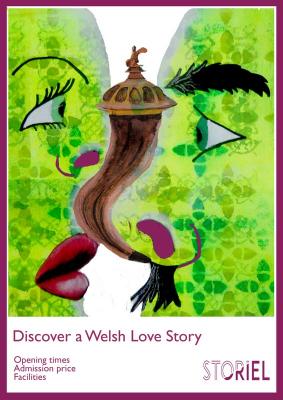
Some problems I ran into included my scanner not picking up the neon colours I had used for the teen poster. It turns out that the type of lamp my scanner has wont pick up this range. I corrected somewhat in Photoshop but the result is still not as bright.
I think the composition of the teen poster works as it focusses on the relationship represented by the object and should be of some interest to this age range. I think, though, that devloping an interactive mobile app that allowed teenagers to snap themselves in historical scenarios and share with friends would be more likely to encourage them. I am reasonably pleased with the final adult poster although I lost the more natural gradiant effect I had achieved with Inkense in the colour visual by colouring in Photoshop. I feel that the purple border (same colour as logo) and logo tie the posters together sufficently to make it clear they are for the same place.
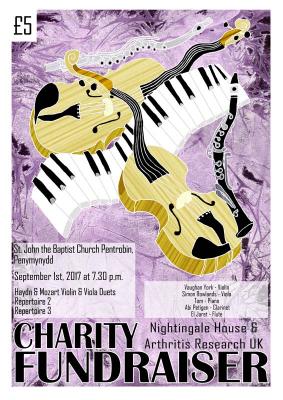
Update Following Feedback
