This exercise involved looking back over illustrators from the past and comparing them to illustrators working now. It was really interesting to visit the work of published illustrators, especially those whose work appeared in books read as a child.
It was particularly interesting that E H Shepard was disatisfied with his close association with the Winnie the Pooh series and that he also produced a large contrasting body of work drawn from his experience serving in WW1.
While visiting older illustrators I noticed the use of more muted colours, in comparison with more recent illustrations. For example, Kathleen Hale’s Orlando the Cat and Edward Bawden’s beautiful prints. I wonder if this was due to availability of pigments at the time or just fashion.
Edward Ardizzone
I chose Edward Ardizzone to look at further, who was, essentially an immigrant. The cultural influences on his work were, however, English resulting in a ‘native’ style – interesting in today’s atmosphere of hatred towards immigrants!! I found the relatively loose, sketchy feel of his illustrations very appealing but the heavy use of black did make it feel ‘old-fashioned’.
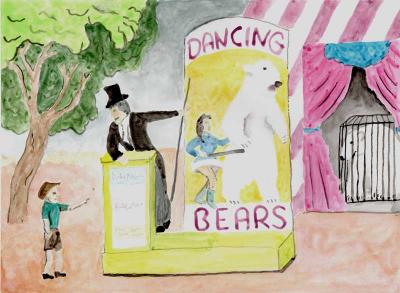
A painting in the style of Edward Ardizzone
I chose the illustration to the right:
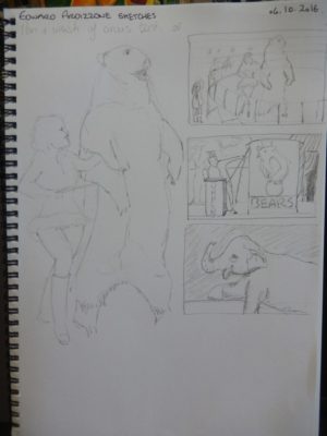
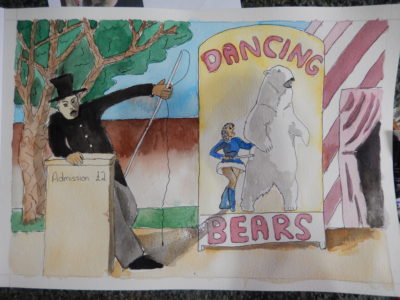
I decided to produce a similar illustration but with dancing bears as the star attraction as they have been in the news recently in relation to cruelty. I used black to darken all my colours and worked in pen and wash as Edward Ardizzone did. Below are my sketches and my illustration.
My sketches are mostly thumbnails of layouts but on reflection I could have tried some sketches of some of Edward Ardizzone’s illustrations. To the left is my finished piece.
Owen Smith
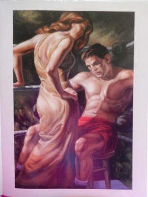
Looking through some illustration books I have, it is clear how many illustrators work digitaly now. I notice a lot of clean shapes and strong colours in the work. Geometric shapes are also common as is fantasylandscapes and creatures. From all the exceptional work I selected Owen Smith. I enjoy his work becaise of the very physical feel of it. He uses oils which is not very common, as far as I can tell, in illustration and I enjoyed the metaphore of his piece ‘Knockout’ (see right).
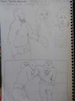
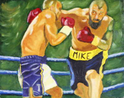
Owen Smith seems to use a lot of white to create highlights and contrast rather than using black for his darks. I tried to reproduce this by mixing my own ‘blacks’. I worked on a woodpanel, just shy of A4, in oil to try to reproduce his technique. I chose the late ‘Iron Mike Towell’ as my subject for this piece as he recently died of concussion related injuries, showing the darker side of a ‘knockout’.
Following Feedback
