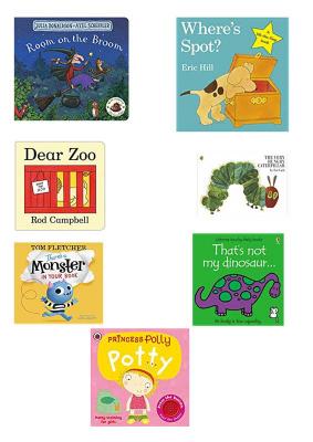
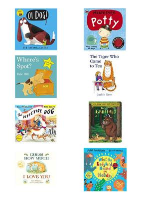
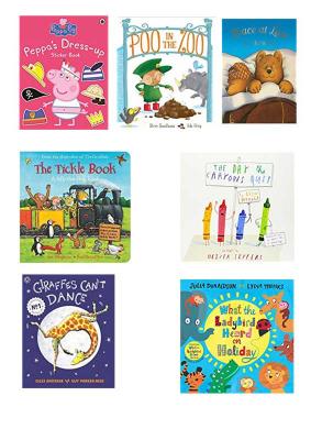
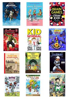
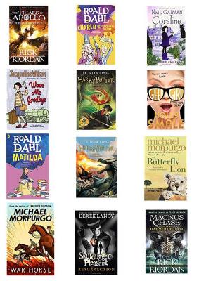
The first part of this exercise was to research age specific children’s illustration. I found the best way to do this was through searches on Amazon as there the books are organised according to age range. However, after only a couple of searches it was clear that age ranges aren’t firm as some books appeared in multiple categories. There are a number of reasons for this crossover:
- Reading age is not always the same as actual age. Actually it often isn’t.
- Some books may be enjoyed by pre-readers by being read to and still enjoy the book as an early reader.
- Second language children may read books from earlier age groups.
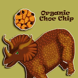
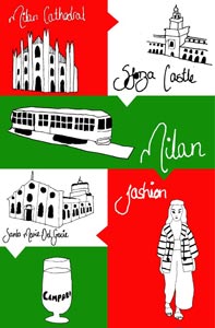
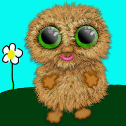
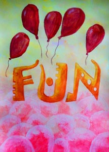
The images below show the book cover illustrations I collected for each age group:
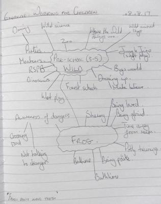
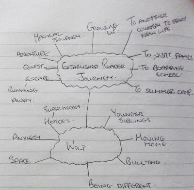
So I mindmapped out for 2 groups:
- Pre-school – Frog & Wild
- Established reader – Wolf & Journey
(mindmaps below)
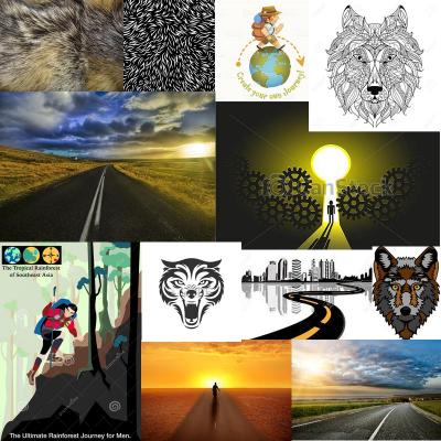
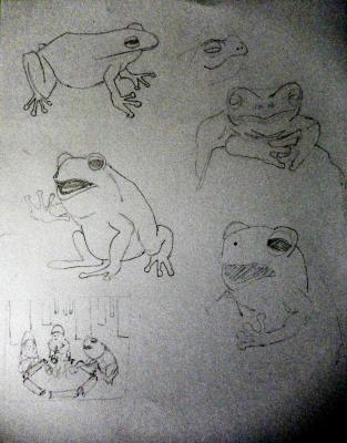
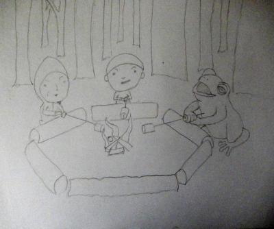
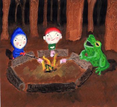
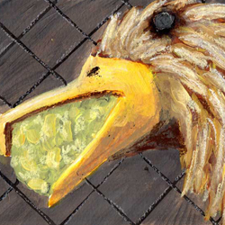
After making some thumbnails and deciding on a simple image I made some moodboards for each illustration (above). For the pre-school children I think forest schools are a fairly ‘wild’ adventure. So I decided to show a dark forest and to keep it not too scary by having the characters toasting marshmallows. I was very conscious in preparing these images about not making them too clean so I opted for a traditional approach. I kept the shapes simple and showed bark texture by scraping into paint. I think the frog could be anthropomorphised further.
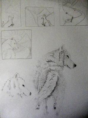
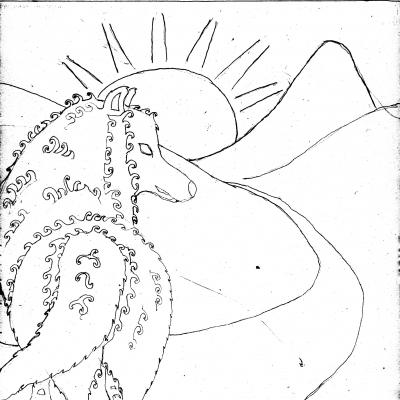
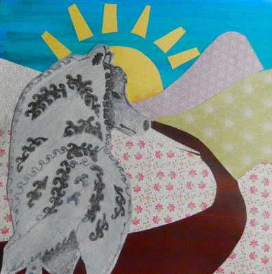
For the established readers I felt the animal should not be anthropomorphised and opted for a more stylised wolf to keep with the patterned landscape. The wolf rendering could be improved.
Wild & Frog
Journey & Wolf
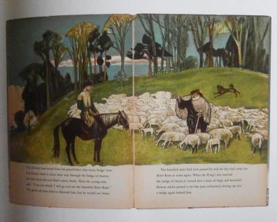
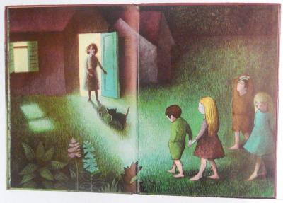
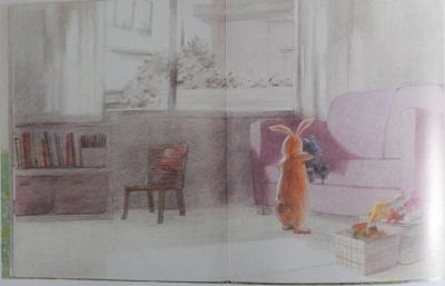
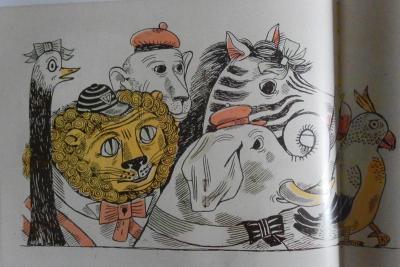
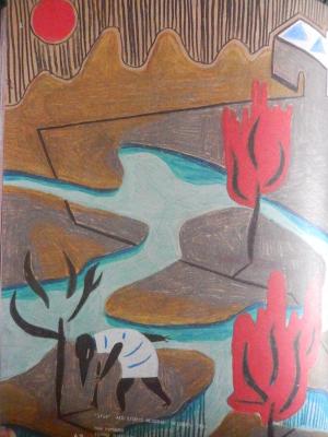
Books for children have not always been illustrated with bright colours as can be seen from these examples of older books below:
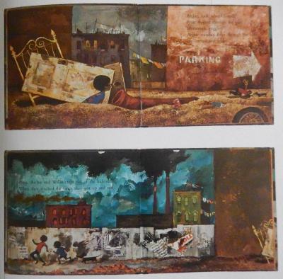
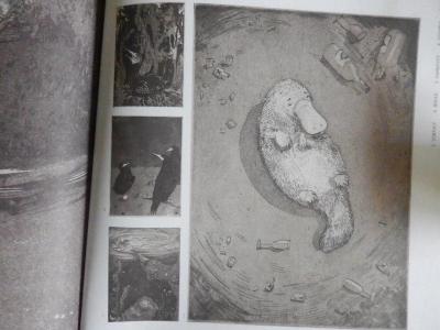
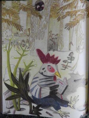
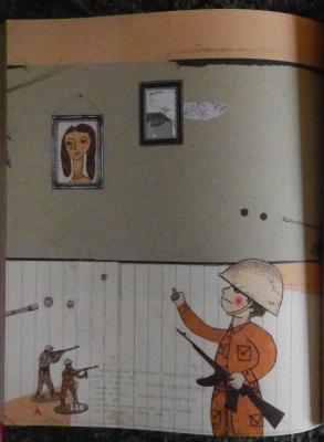
Many examples of current and contemporary illustrations for children are given in the Bologna book fair annual. I selected a number that show a lack of bright colours:
It is not clear from my references what age the example illustrations are aimed at. However, they do show illustrations that are appealing and engaging. I do not think bright colours are essential in all children’s illustration but I do think they help for the youngest children and as an eye catching device (e.g. on a cover or cereal box).
