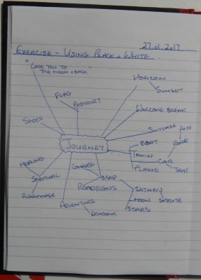
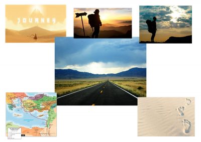
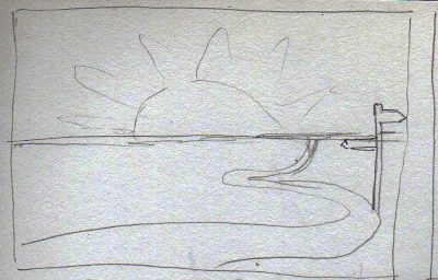
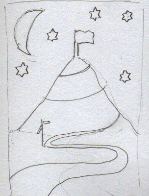
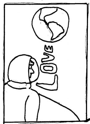
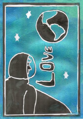
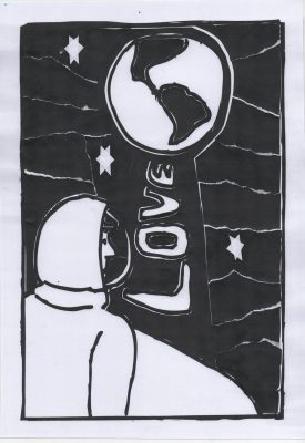
In this exercise we chose a word to illustrate. I chose journey. The illustration could be of objects or in a ‘more narative style’. I started off with a mindmap of words relating to ‘journey’ and then expanded this with a search on Google to create a moodboard. I then sketched out some thumbnails based on what I had so far. The ‘journey’ that stood out for me was the one inferred by the saying/endearment “I love you to the moon and back” and I decided to go with this thumbnail.
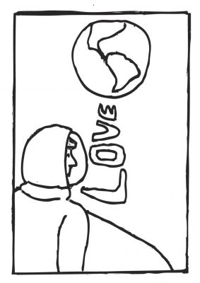
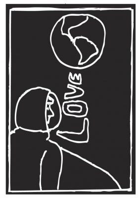
Having printed out the line drawing and the negative I cut pieces from the negative to complete the line drawing. I chose to cut some pieces and tear other for interest. I cut some sections out whole, like the space around the word love and connected it to the Earth. By keeping this section whole I hoped emphasise ‘love’ as the path back to Earth. I added back in white ‘stars’ at the end to complete the image.
Overall I was pleased with the outcome of this image and I used the negative pieces to create a piece using colour as an experiment. I quite enjoy graphic style illustrations as many of them can be really clever. I found some examples online at http://fearlessflyer.com/9-inspiring-graphic-designers-and-their-distinct-design-styles/. Avinoam Noma Bar’s work is very direct and I enjoy the elegance of Shigeo Fukuda’s piece about freedom for writers (or at least that’s what I think it’s about).
